Designing websites
The use of colours in designing website and application graphical interfaces.
The terms hue and colour are very often used completely interchangeably. According to a certain Polish Language Dictionary, it is the latter that is the superordinate term. Colour is defined as ‘a sensation produced in the brain when the eye receives electromagnetic radiation from the visible light spectrum’1. Yet, the same dictionary describes ‘hue’ only as ‘colour, colouration’.
In painting, there is a strict distinction between hue and colour. Hue is a term referring to a specific physical feature of the paint, while colour is considered to be a wider phenomenon, which refers to human psychophysical abilities. A similar division exists in the printing industry, where a hue can be applied to a specific substrate, e.g. a sheet of paper, to create the desired colour effect.
Colour perception is a subjective matter based on a complex psychophysical process. Modern knowledge about colour psychology is steadily evolving thanks to clinical observations and numerous research experiments carried out in many fields of science. Its origin dates back to the pioneering work of Johann Wolfgang Goethe (‘Theory of Colours’, 1810), which had a significant impact on this discipline and was confirmed many years later by others, including Thomas Young and Herman von Helmholtz. Like Goethe, they proved that it is not possible for every point of the human eye’s retina to contain the number of particles capable of vibrating in accordance with the light wave. It was thus assumed that their number is limited and that the human eye contains a set of only three receptors which give an impression of red, green and blue colours. This property of the human eye gave birth to the colour creation system commonly known as RGB (Red, Green, Blue). It is widely used in computer graphics, which uses displays as its primary resource.
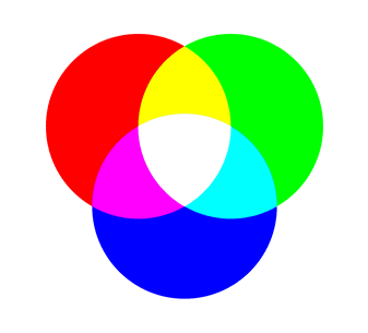
RGB is an additive colour reproduction system, with the colours themselves being created using a combination of red, green and blue. For example, combining red and green yields yellow.
Depending on the parameters, graphics cards and displays can render anywhere from 256 to over a million different colours. In professional applications of the RGB system, it is possible to use a 48-bit model, which enables a 16-bit description of each component. In such a case, the scale’s range will be between 0 and 65535. For example, white will be designated as 65535, 65535, 65535, whereas red as 65535, 0, 0.

Figure 1. An example of colour reproduction with the use of the RGB (Red, Green, Blue) palette
The ERGB system (Enhanced RGB) allows the user to define transparency as well. In this case, every hue is described by four numerical values, and the resulting colour is created by applying all previously defined layers. The subject literature and bitmap graphics programme interface markings refer to this transparency attribute as the ‘alpha channel’. As a result, the ERGB system is also sometimes referred to as RGBA (Red, Green, Blue, Alpha).
It should also be mentioned that each device has its own spectral interpretation of colour. The colours of a photo displayed on an LCD display may differ from the ones on the matrix of the digital camera that took it. Print, on the other hand, uses a colour model of a different kind. Printing machines use CMYK (Cyan, Magenta, Yellow, Black, or key colour), while displays use the RGB model. As such, some colours applied in printing cannot be shown properly on a computer display.
Another interesting colour presentation model is the HSB (Hue, Saturation, Brightness), which simulates the way humans perceive colours. It is based on the three key characteristics of colour: hue, saturation and brightness. ‘A shade or a hue in its purest form is a feature that characterises such colours as yellow, red or blue. It is a result of the way we perceive the light of a certain frequency that is being reflected by an object (...). Value – ‘the lightness or darkness of a colour is its value’. This property is also referred to as colour tone, luminosity or brightness. It is completely dependent on the shade and intensity of the colour. The contrast level and value relations make compositions more dynamic. Since it is natural for distant objects to appear brighter, the value can be used to create an illusion of space and depth. Saturation – ‘saturation is the intensity or brightness of a colour, or more precisely their level of saturation. (...) a saturated colour is bright and intense, as opposed to an unsaturated one, which appears subdued (...). Saturated colours attract the viewer’s attention. Use unsaturated colours when prioritising efficiency and functionality. Unsaturated light colours give a more friendly impression, while unsaturated dark colours appear more formal and saturated ones are dynamic and stimulating. Combining saturated colours is risky, as it may cause a visual distortion that will cause eye strain’2.
The LAB colour model is based on the way the human eye perceives colour. As in the case of other models, its components are determined by numerical values, which in turn determine the appearance of the colour itself. It does not, however, provide information about what values (dyes) should be used to display a specific hue on a given device.
The colour selection process includes the following stages: (1) defining the goal we wish to achieve – including by the use of colour; (2) choosing the main colour; (3) creating a colour scheme based on the main colour; (4) implementing the colour scheme into the project.
When designing graphical interfaces, one should always follow the universal rules which enable the optimal aesthetic and perceptual effect. For this purpose, only a moderate number of colours should be used. By adding too many colours, one may introduce unnecessary chaos, reduce the visibility of important elements and cause eye strain. These recommendations primarily concern projects whose purpose is not just a large number of visits, but also user involvement, expressed by a relatively long resource use time and numerous re-visits to the website in question.
From the project implementation perspective, it is also vital that the website's colours match both the brand and the nature of the message. For example, on a website dedicated to water sports, blue (#0000FF), turquoise (#30D5C8) or teal (#008080) will likely be the most dominant colours.
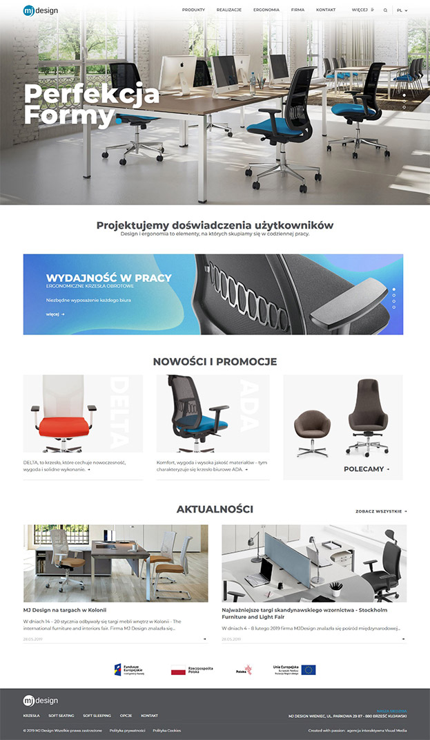
The use of relatively strong contrast is recommended when the publisher intends to emphasize functions such as ‘register’, ‘contact us’, ‘calculate your loan instalments’, or other vital content like article titles, system warnings and short instructions. In this approach, the use of buttons with coloured backgrounds should both correspond with the nature of the message and take the entire composition into account. If a company offers services or specific technological products through its website, using vivid, saturated colours is certainly warranted. Figure 2 presents the proper way of building a graphical interface. Apart from typographic elements, its most distinguishing features are the consistently accented details. In addition to attractive graphics, in this case website users benefit from a friendly interface containing message prioritisation elements.

Figure 2 Home page of the website designed by VISUAL for MJ Design.
The dominant factor affecting a graphical interface’s efficiency is the use of appropriate colour schemes and hierarchy. Apart from instances where certain colours simply do not match each other, adopting a method that ensures a universal approach to any projects implemented is always a good option.
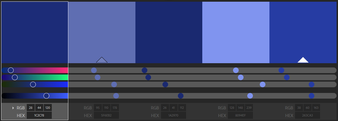
One of the tools that make it possible to generate harmonious colour schemes is a special app by Adobe (https://color.adobe.com/pl). It provides a set of rules for choosing colours, including those based on the monochrome palette. This allows you to select one colour and create multiple harmonising shades based on it. In figure 3, navy blue is the base colour. The other shades were created automatically. These colours can be used to differentiate the individual elements of the main menu.
A colour’s strength and visibility within any visual scene are also determined by its amount. If a colour is used in a relatively large area, it becomes the dominant one. However, in the opposite situation, it will constitute an accent that can be used to create the CTA buttons mentioned earlier, as well as other elements. It is recommended that only pure (dominant) colours be used as such accents.
Optical interactions between colours are largely determined by the biology of the human eye. Nonetheless, associations caused by specific colours (their interpretation) evoke numerous connotations that depend on one’s individual values.

Figure 3 Colours designed based on a monochrome palette using the Adobe tool https://color.adobe.com/pl
In this regard, both private and social spaces can be distinguished. It should also be noted that numerous relationships which allow us to decode specific symbolism exist between them as well. Therefore, colour preferences determine our motivations, identity and needs – e.g. those related to our sense of security. While the physical mechanism of vision allows all healthy humans to distinguish a relatively large number of colour shades, their perception is a relatively complex process. It should also be noted that the viewing angle, type of light (its strength and type – daylight or artificial light), as well as sight impairments all have a significant impact on the final interpretation of what we see. It is not about a phenomenological approach, represented by the likes of Rudolf Arnheim, who claimed that ‘no one will ever be sure that his neighbour sees a particular colour exactly the same way he himself does. We can only compare colour relations, and even that raises problems. (...). Recent studies have suggested that the basic colour names, relatively few in number, are common to all languages, but also that they cover different ranges of hues and that not all languages possess all these names’3.
Creating useful websites requires skilful adaptation of colour codes to the specific contexts of their use. Therefore, project teams should have the knowledge on how to form a hierarchical layout of the presentation layer and adapt it to their communication goals as well as human perception. In this sense, the colour becomes a key element that has an impact the effectiveness of any such interaction.
Author: dr Robert Antoszczak
1. Source: http://sjp.pl/barwa
2. Merleau-Ponty, Phenomenology of perception, Fundacja Aletheia, Warsaw 2001, pp.
3. R. Arnheim, Art and visual perception. Psychology of the creative eye, Oficyna, Łódź 2013, pp. 351–352.